Redesigning "Spring" Backoffice
User Research
As a B2B product some of the users using it were our company’s employees working locally, and the second part of the users were our partner companies who were using BetConstruct’s services. The fact that we had our users on the premises was fantastic for us as we had direct access to all the information within the company.
User Interviews
We set up interview sessions with our users and prepared questions and use cases that we would need them to go through depending on their different roles and tasks. We prepared our interview questions with the intention of understanding which main features should be enhanced or eliminated, such that we could quickly build a new version that responded to the needs of our users.
We conducted interviews for a total of 5 users - 1 advanced user (we found an employee who had used the tool regularly for more than 5 years), 2 intermediate and 2 new users. We asked them to walk us through their daily tasks and to think out loud, letting us know their frustrations or appreciation toward the tool and asked them to perform specific use cases. During the interview, we tried to use the “5 Whys” technique and also tried to understand the main “What, How, Why” behind every behavior.
We conducted interviews for a total of 5 users - 1 advanced user (we found an employee who had used the tool regularly for more than 5 years), 2 intermediate and 2 new users. We asked them to walk us through their daily tasks and to think out loud, letting us know their frustrations or appreciation toward the tool and asked them to perform specific use cases. During the interview, we tried to use the “5 Whys” technique and also tried to understand the main “What, How, Why” behind every behavior.
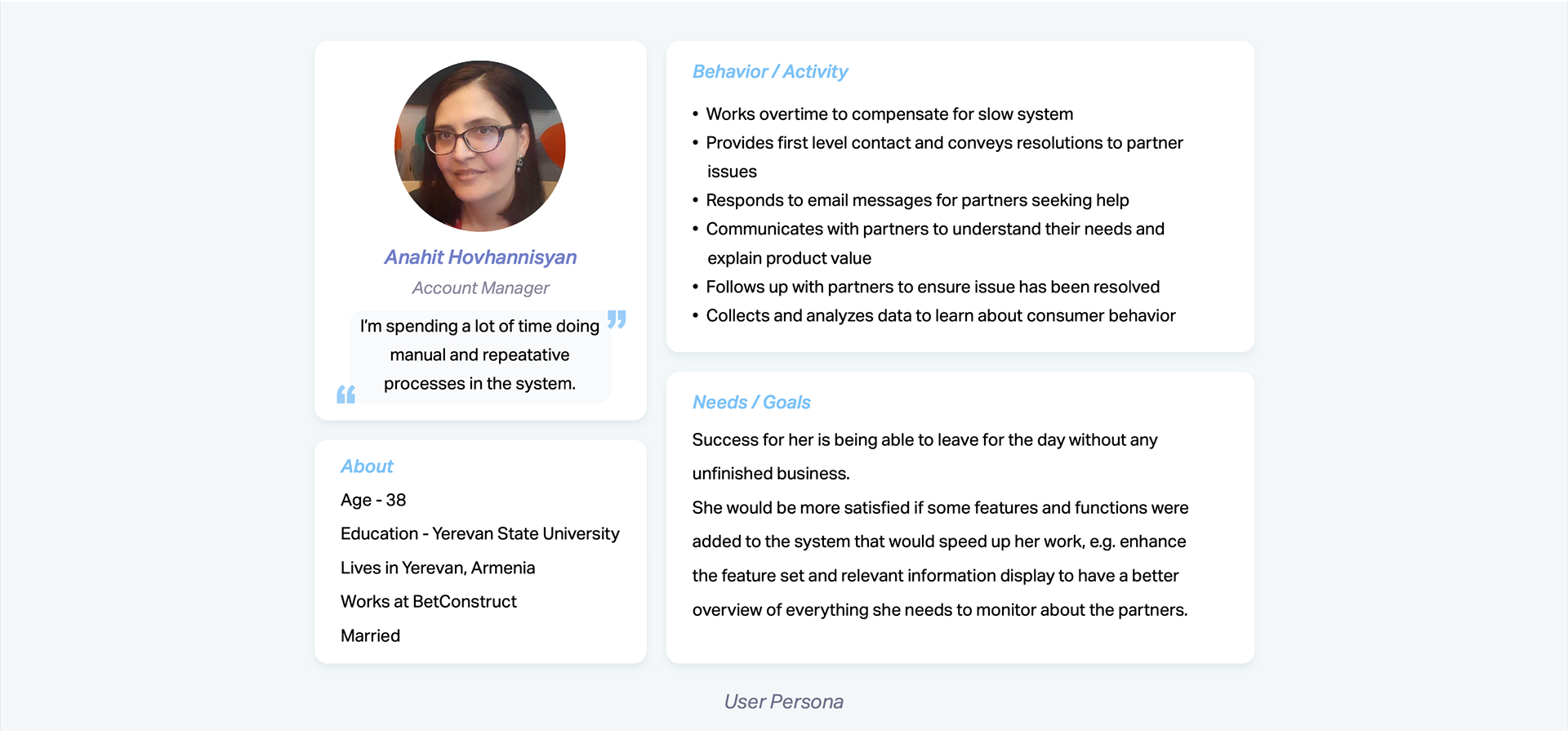
Creating User Persona
After the user interviews were done, we had a better understanding of our users, their needs and goals. So we created the persona with information regarding their day-to-day responsibilities, features and functions that were important to them, their thoughts, behavior and activity, needs and goals.
Stage 2: Define The Problem
Once the persona was well defined, my colleague and I proceeded to analyze all the information captured during the user interviews noting down all the problems the users had performed their day-to-day tasks.
The main problems we identified were:
• Validation of most of our hypotheses about potential usability issues
• On the dashboard there was lack of data visualization and charts, as most of the information
was shown with data tables. Besides the dashboard needed customization for widgets as users
were seeing more data than they needed for making decisions.
• The users needed a surface where they could easily overview each customer and modify their
information if needed. In the current system, they had to navigate to many different places and
levels to gather this information.
• As most of the sections in the system were about data tables with filters and actions, users
needed improvements and advanced options such as table row sorting, column customization, resize, dragging and pinning.
Stage 3: Ideation
After determining what wasn’t working we gathered the team to brainstorm. Using all the insights from the stakeholder and user interviews, we created a document that listed all the proposed requirements for the features and functions that should be built in the new version to increase efficiency.
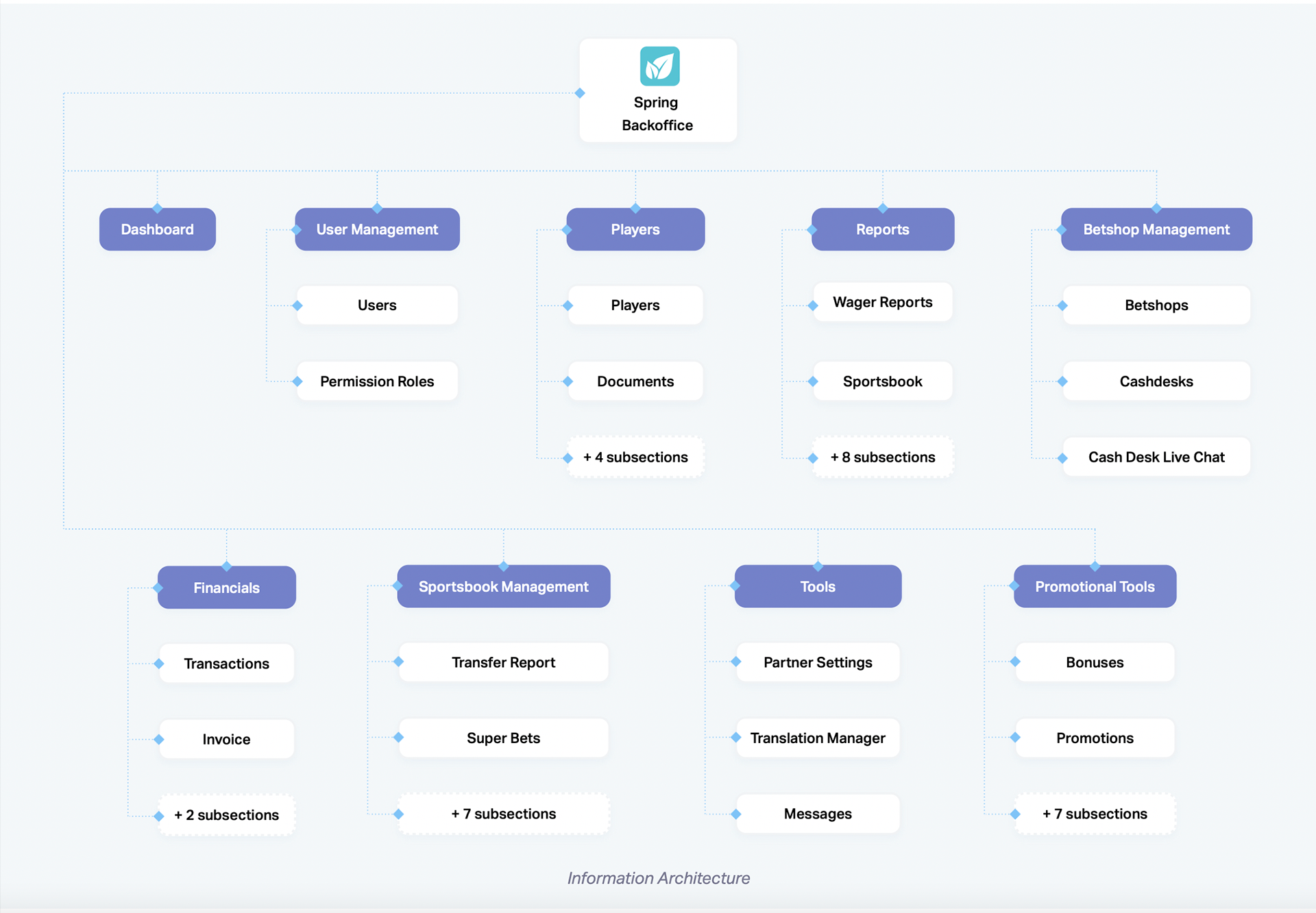
Mapping Out The Information Architecture
It was crucial to define the skeleton of the new backoffice system, as there were a lot of intricate connections and workflows all linking to one another. So, the best part to start with was the information architecture, defining the structure of the tool and grouping the different functions into logical sections allowing users to be able to navigate the system as quickly and intuitively as possible.
On the old version of the backoffice some of the products were included in the navigation, so first we needed to take them out and leave there the sections that belong to the Spring backoffice.
Once the main structure of the system was defined we could start to conceptualise the design of the new backoffice screens and translate our concepts into visual form. For this phase, we created low fidelity wireframes.
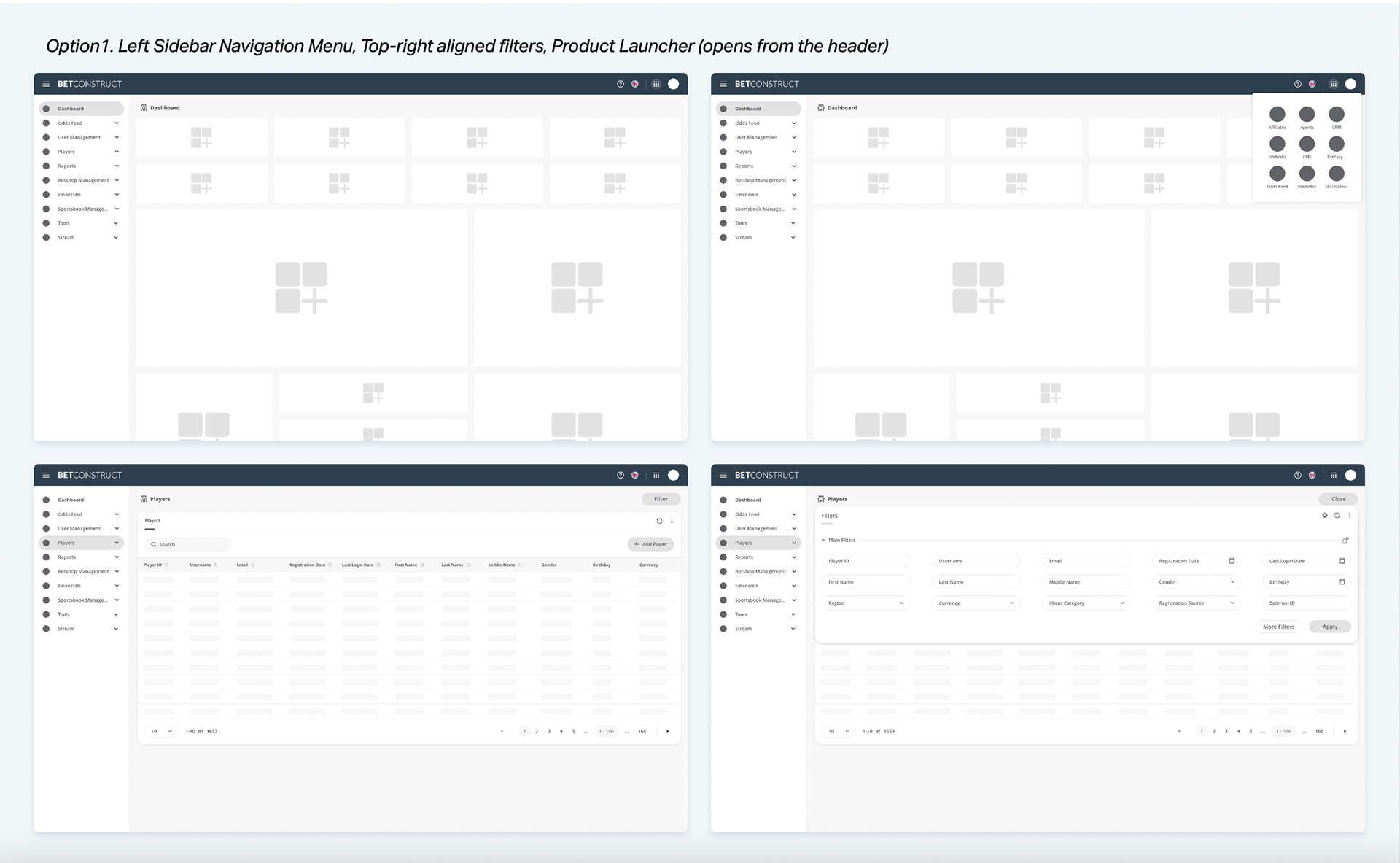
As the main structure of the product largely depended on the extensive navigation, data tables and its filters, we first started solving that issue. We created 3 options of wireframes and conducted heuristic evaluation with the experts of betting industry.
As the main structure of the product largely depended on the extensive navigation, data tables and its filters, we first started solving that issue. We created 3 options of wireframes and conducted heuristic evaluation with the experts of betting industry.
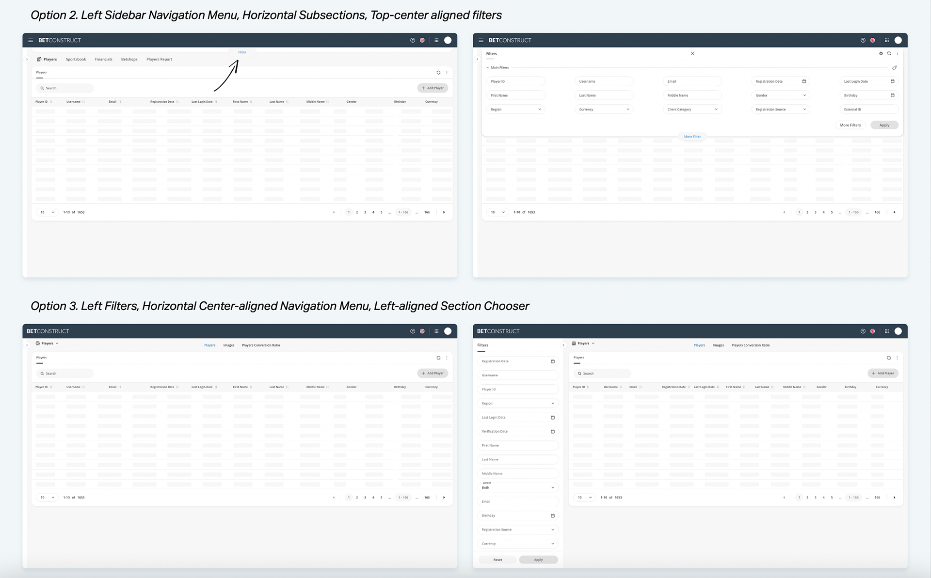
After having some meetings and discussions with the evaluators and examining the wireframes and judging their compliance with recognized usability principles, we decided to choose third option. We made some improvement on it by taking “Section selector” to the header. The reason was it would cause problems for small sizes of device screens, as the central horizontal navigation would overlap it.
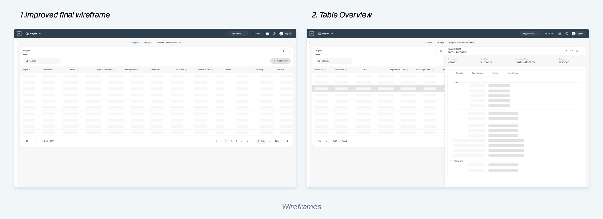
Once we solved the “Navigation and Filters” issue, we came up with a lot of design solutions and ideas for new features. As users mentioned that they were navigating a lot within the system to find the needed information, we created the “Overview” option for tables, where we located the most important information that user’s needed first. We conducted additional interviews with the users to understand how they prioritized the information in the system.
Once we solved the “Navigation and Filters” issue, we came up with a lot of design solutions and ideas for new features. As users mentioned that they were navigating a lot within the system to find the needed information, we created the “Overview” option for tables, where we located the most important information that user’s needed first. We conducted additional interviews with the users to understand how they prioritized the information in the system.
Stage 3: Ideation
High Fidelity Visuals Based On Atomic Design Library
Once the wireframes were validated, we started creating the high fidelity visuals based on the atomic design library we created beforehand. The solutions we validated through the wireframes(header, navigation menu, data table, filters and table overview) became reusable template patterns within our design system, which then had been used in our next products we redesigned.
Usability Testing
After validating the UI with the stakeholders, the front-end developers would then implement the designs. Before the development process would start we conducted usability testing to ensure that the final designs don’t cause any problems and were ready for implementation.
The users were given clickable prototypes to perform some tasks. From the feedback we received, any existing problems we identified were analyzed and prioritised by level of impact on the product.
So far, no major workflow problems were identified, only minor bugs and interface fixes that were easily fixed. We just changed filter bar opening arrow background, as users mentioned that it was a bit hard to notice, also changed the base background color to darker tone of blue, and expanded table overview through the page.
It’s always a great feeling to discover ways in which we can continuously provide a better experience for the users. We received positive remarks from the users, the internal employees, stating with excitement, how happy they were to see the product evolve and meet their needs. They were also very appreciative of how involved we kept them throughout the process and how they could see their input making a difference.
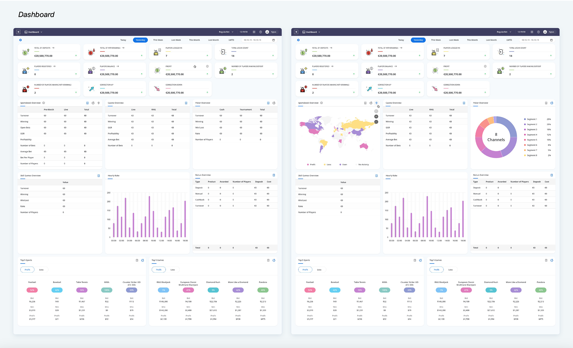
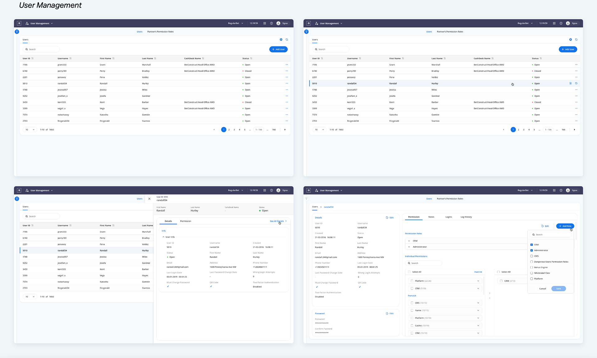
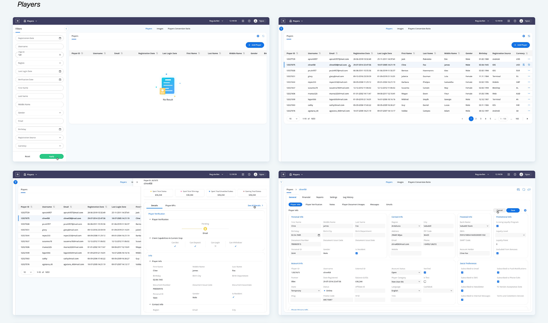
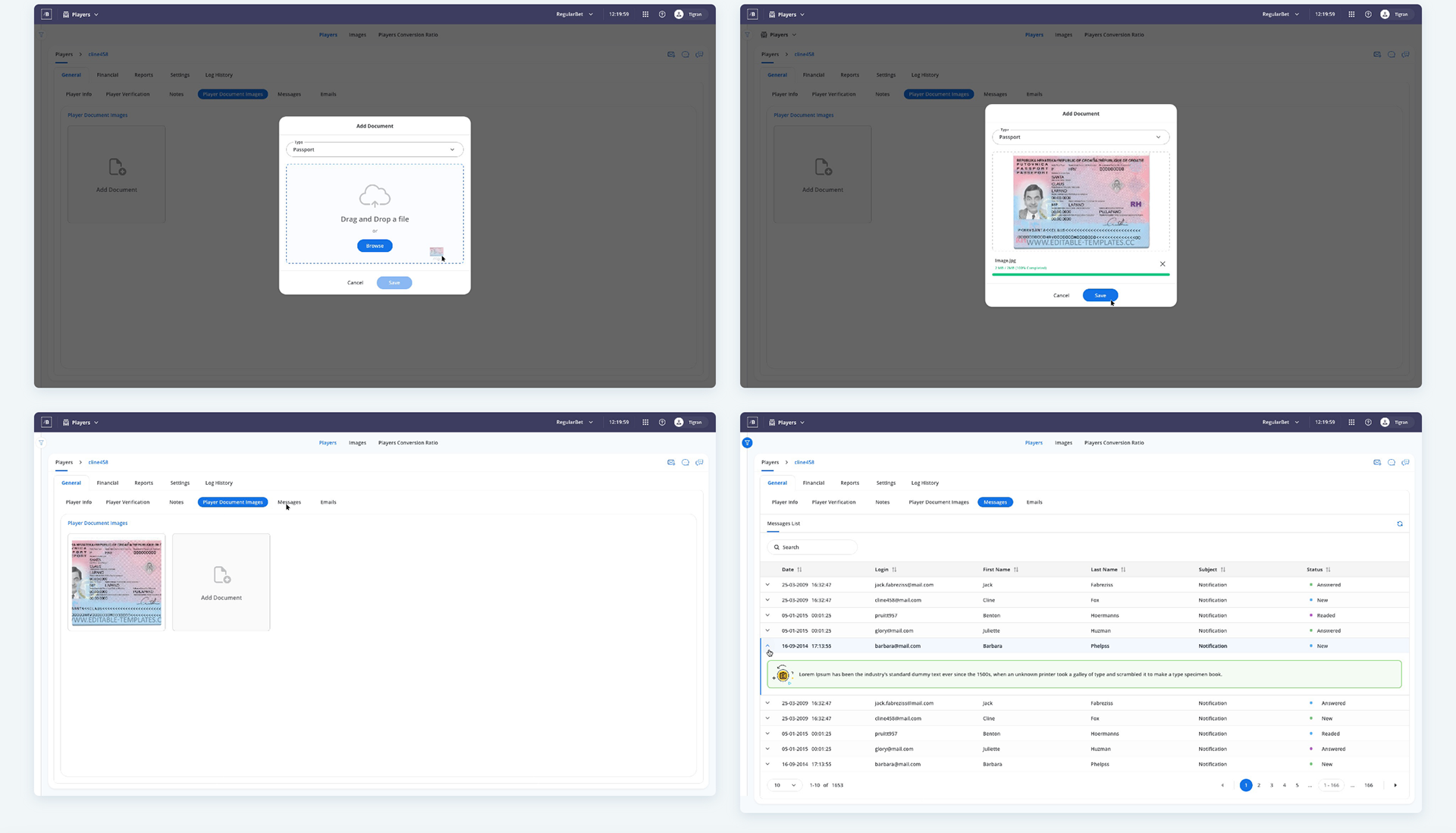
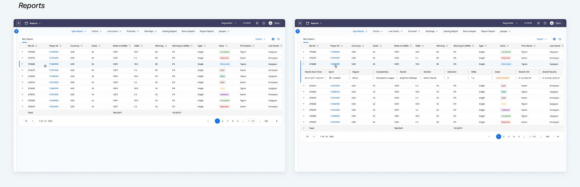
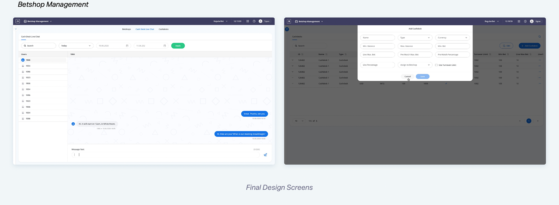
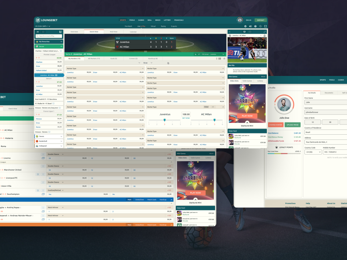
Below you can find some of the final UI design screens.
The users were given clickable prototypes to perform some tasks. From the feedback we received, any existing problems we identified were analyzed and prioritised by level of impact on the product.
So far, no major workflow problems were identified, only minor bugs and interface fixes that were easily fixed. We just changed filter bar opening arrow background, as users mentioned that it was a bit hard to notice, also changed the base background color to darker tone of blue, and expanded table overview through the page.
It’s always a great feeling to discover ways in which we can continuously provide a better experience for the users. We received positive remarks from the users, the internal employees, stating with excitement, how happy they were to see the product evolve and meet their needs. They were also very appreciative of how involved we kept them throughout the process and how they could see their input making a difference.
Below you can find some of the final UI design screens.